Color Palette from Image
Pick a photo and get its color palette: the main colors with their HEX and RGB codes, any spot you tap, and which text colors stay readable on each one. Then design a pin in those colors. Your photo never leaves your device.
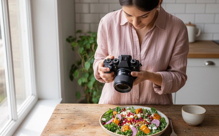
Tap any spot on the photo to pick its color
Your palette6 colors from this photo
The color you tapped
Readable text on each color
The best text color for each — from the palette, or white or black — graded by the W3C's contrast rule: AA needs 4.5:1, or 3:1 for large text.
The rule and the formula: W3C, WCAG 2.2, success criteria 1.4.3 and 1.4.6. Checked 25 September 2026.
Quick answer: pick a photo above and the tool pulls out its 5, 6 or 8 main colors, each with its HEX and RGB code and how much of the photo it covers. Tap any spot to get that exact color. Under the palette, every color is paired with the text color that reads best on it, graded by the W3C's rule: normal text needs a contrast ratio of at least 4.5:1, large text 3:1. Then open the Pin Designer with those colors already set. Your photo is read by your own browser and never uploaded.
How to use it
Press Use your photo and choose one from your phone or computer, or try one of the four sample photos. The palette appears at once: a strip sized by how much of the photo each color covers, then the codes, each with its own Copy button. Choose 5, 6 or 8 colors. To get one exact color, tap that spot on the photo: its code shows up under the palette, and Add to the palette puts it in. Copy link sends the palette to someone else. The link carries the codes, never your photo.
How the palette is picked
A photo has hundreds of thousands of pixels, and many of them are nearly the same color. The tool takes a sample of them and sorts them into sixteen groups of similar colors. It judges "similar" by how different two colors look to a human eye (a color space called CIELAB), not by their raw RGB numbers, which treat some very different-looking colors as close. The groups are split where the pixels are, so a big wall gets several shades and a stray glint gets none. From those groups it picks the palette one color at a time. The first is the color that tells you most about the photo. Each next color is the one that is common enough and most unlike everything already picked, with extra weight for vivid colors. So a small splash of red on a plate makes the palette, and a second beige a shade off the first does not. The same photo always gives the same palette.
That is also why two palette tools rarely agree exactly. Each one groups the pixels its own way. A palette is a reading of the photo, not a fact about it. Keep the colors that feel right and add the ones you tap.
Which text is readable on each color: the W3C's rule
A pin is read on a phone, in a feed, in a second. If the title is too close in brightness to the color behind it, it disappears. The rule used here is the W3C's Web Content Accessibility Guidelines (WCAG 2.2). It compares the two colors' relative luminance and gives a contrast ratio from 1:1 (the same color) to 21:1 (black on white):
- AA: "a contrast ratio of at least 4.5:1". For large text, "at least 3:1" (large means "at least 18 point or 14 point bold").
- AAA: "a contrast ratio of at least 7:1", and 4.5:1 for large text.
For each palette color the tool tries every other color in the palette, plus white and black, and shows the best one. A ratio is cut to two decimals, never rounded up: 4.49:1 is shown as 4.49 and fails AA, even though it looks close. On a pin, aim for AA even for a big title. A pin shows up small in a feed on a phone, and the large-text allowance assumes the text is actually large.
Designing a pin in these colors
A feed where every pin uses the same few colors reads as one brand. A feed where each pin uses different colors reads as thirty unrelated accounts. The tool suggests a set of three from your palette. The background is the color that covers most of the photo and still has a readable title color. The title color comes from your palette where one reads on the background, and otherwise white or black. The accent is the most vivid color left that still shows against the background. Design a pin in these colors opens the free Pin Designer with the three saved as your brand colors. Its Brand kit panel changes them or turns them off. Before you publish, check the words with the pin title & description checker.
HEX and RGB
They are the same color written two ways. HEX (#B3124E) is what design tools, Canva, CSS and WordPress themes ask for. RGB (179, 18, 78) is the red, green and blue levels from 0 to 255 that the HEX code spells out in base 16. Copy whichever your tool wants. Save the palette as a pin makes a 1000×1500 image of the photo and its colors with every code on it: a board of palettes is a popular kind of Pinterest board, and a palette pin is easy to make one of.