Pinterest Pin Design: The Complete 2026 Guide
Design decides whether your keyword research ever pays off. Here’s the complete guide to pins that stop the scroll — layout, text, colour, imagery and the mistakes to avoid.
By Mia Bennett · PinPinterest editorial team

There is a particular kind of frustration I hear constantly, and I felt it myself for a long time: you did the keyword research properly, you found a phrase with real demand, you wrote a good title — and the pin still went nowhere.
The instinct is to blame the algorithm or conclude the keyword was wrong.
Usually neither is true.
Usually the pin simply did not look worth stopping for.
This is the uncomfortable truth about Pinterest: keywords get you shown, but design decides whether being shown turns into anything.
You can win the distribution lottery and still lose, because a person scrolling at speed made a half-second judgement and their thumb kept moving.
Design is the conversion layer sitting on top of all your SEO work.
The good news, and I mean this genuinely, is that Pinterest design is not an art contest.
It is a small set of legibility rules applied consistently.
I am not a designer and my pins do fine, because the rules do the work.
This is the complete guide to those rules — layout, text, colour, imagery, format — and how to apply them without spending your life in a design tool.
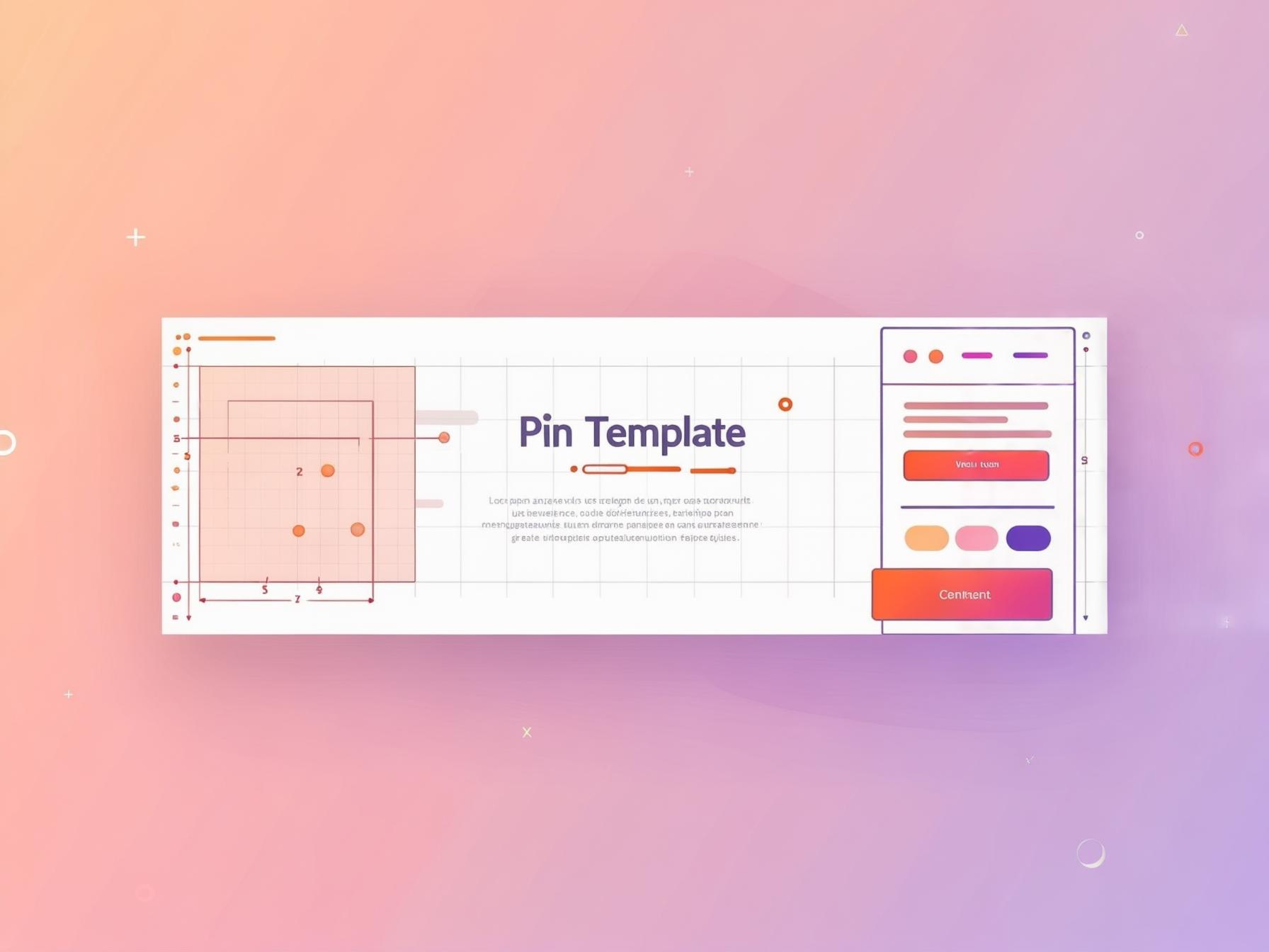
1
Bold keyword headline
The searched phrase — big and readable
2
High-contrast hero image
One clear focal point for the thumb
3
Your logo or handle
Small corner mark that builds trust
4
A clear benefit / promise
Tells a human exactly why to click
The one principle everything else follows from
Clarity beats artistry.
That is the whole philosophy, and every specific rule below is just an application of it.
Your pin is competing in a fast-moving grid on a small screen against dozens of others, and the only question that matters is whether a stranger can tell what it offers in roughly half a second.
A subtle, tasteful, artistic pin that requires a moment of thought has already lost, because nobody grants it that moment.
A slightly plain pin that instantly communicates “small bedroom ideas for renters” wins.
This is liberating rather than limiting: you do not need talent, you need rules — and rules can be learned in an afternoon.
Start with the right canvas
Before any creative decision, get the shape right, because the wrong ratio quietly undermines everything else.
A 2:3 vertical ratio — 1000×1500px is the standard — fills the feed properly without being truncated.
Square pins take up less vertical real estate and get less attention; excessively tall pins get cropped, which usually amputates your headline.
To check an image you already have, the free image size checker reads its shape and crops it to 2:3 on your own device.
This is a ten-second decision that affects every pin you make, so set your template once and never think about it again.
The full spec breakdown lives in pin dimensions and design specs, but if you remember only one number, make it 1000×1500.
2:3
1000 × 1500 ✓
The sweet spot
1:1
Square — weaker
too tall
Gets cut off
Text: the part that does the ranking and the converting
The text on your pin does double duty in a way nothing else does.
Pinterest reads it, which helps it understand and rank your pin.
Humans read it, which is what makes them click.
A gorgeous pin with no text is a missed opportunity on both counts — it cannot be understood by the machine and it does not make a promise to the person.
So your headline should be the actual search phrase, written large enough to read as a thumbnail.
That means much bigger than feels comfortable when you are looking at it full-size on a laptop.
The specifics of what to write and where to place it are covered in text overlay on pins, and the wording itself in pin titles that rank.
Fonts and colour: pick once, reuse forever
Typography and colour are where people burn the most time for the least return, so let me shortcut it.
Choose one bold, chunky font for headlines and one clean simple font for anything smaller.
Avoid thin, decorative and script fonts entirely — they look elegant at full size and turn into illegible mush at thumbnail scale.
For colour, pick two or three brand colours and reuse them relentlessly.
Consistency is what makes a feed of your pins recognisable, which is quietly how savers become followers.
The deeper treatment is in best fonts for Pinterest pins and pin colours that get clicked.
Imagery: one clear subject, always
Whether you use photography or graphics, the rule is the same: one clear focal point.
A busy collage with six competing elements gives the eye nowhere to land and reads as noise at small sizes.
A single strong subject with breathing room around it reads instantly.
If you use photos, bright and high-contrast beats moody and atmospheric almost every time on Pinterest — practical guidance in photos that work on Pinterest.
And whatever image you use, leave deliberate space for your text rather than cramming the headline into whatever gap remains.
The half-second test
Shrink your finished pin to thumbnail size and glance at it for half a second. Can you read the headline and tell what it offers? If not, no amount of keyword research will save it. This single test catches the overwhelming majority of design problems before you publish.
The mistakes that quietly kill performance
Most underperforming pins fail for the same handful of reasons, and every one is a two-minute fix once you can see it.
Text too small, no keyword on the image at all, low contrast between text and background, the wrong aspect ratio, and too many competing fonts and colours.
Text too small to read
No keyword on the image
Low contrast
Wrong aspect ratio
Too many fonts
I have written a full diagnostic version of this in pin design mistakes that kill your clicks, because working through that list on your last twenty pins is usually more valuable than designing twenty new ones.
Formats beyond the standard pin
Standard static pins are the workhorse and should be the bulk of your output.
But two other formats are worth knowing when they help.
Infographic-style pins — a headline plus numbered steps — are exceptionally save-worthy because they promise something useful to keep (infographic pins).
Carousels let you tell a short sequential story across several cards, which suits step-by-step content and before/after reveals (carousel pins).
And video adds motion for reach, though it typically trades away some outbound clicks (video pins).
Match the format to the job rather than chasing whichever is newest.
Build a template, then stop designing
Here is the workflow that makes all of this sustainable.
Design one clean template with your fonts, colours, layout and logo placement locked in.
Then every new pin is a duplicate with the text and image swapped — two minutes rather than twenty.
That speed is what lets you maintain the fresh-pin cadence Pinterest rewards.
Build a small family of three to five template variants so your pins stay visually fresh without becoming repetitive, exactly as laid out in pin templates that convert and the practical Canva guide.
Consistency plus speed genuinely beats occasional brilliance here.
Let data pick your style, not taste
The final and most important step: stop guessing which designs work.
Publish several styles, then look at which ones actually earn saves and clicks relative to their reach.
Your personal favourite and your best performer are frequently not the same pin, and the data is what saves you from scaling the wrong one.
Native analytics will not show you which designs rank or how their momentum compares, which is precisely the gap PinPinterest fills — so you can see which template and style genuinely earn engagement and make more of that.
Design on rules, then refine on evidence, and your pins get measurably better every month instead of merely different.
See which of your pin designs actually earn saves
Go deeper: fonts, colours, text overlay, photography and design mistakes.
If you would rather apply these rules than redraw them, the free Pinterest pin maker builds them in — legible headline zones, high-contrast panels and the 2:3 export size — with no account needed.
#pin design#pinterest design#visual marketing#design guide
More in Design10 other guides in this categorySee all Mia Bennett is the pen name the PinPinterest team writes under. Our guides share what we learn building a Pinterest analytics tool — no fluff, just what actually moves traffic.