Pinterest Pin Colors: What Actually Gets Clicked
Colour affects whether your pin is noticed and whether your text can be read. Here’s what performs on Pinterest, how to build a palette, and the contrast rule that matters most.
By Mia Bennett · PinPinterest editorial team

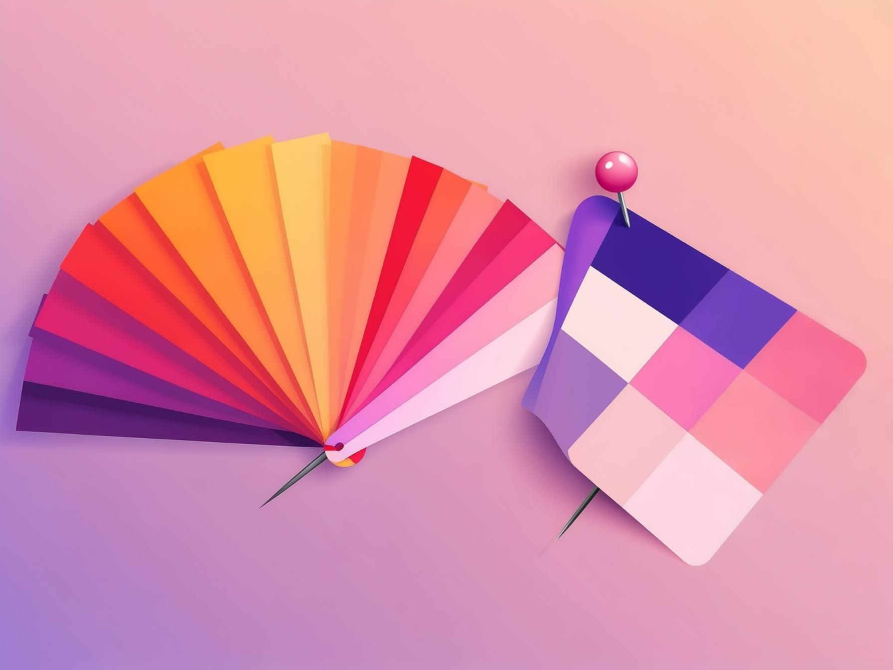
Colour advice online tends to arrive with suspicious confidence — “red converts best”, “blue builds trust”, that sort of thing.
I would treat all of it with scepticism.
In years of making pins I have never seen a specific colour reliably outperform another across niches.
What I have seen, repeatedly and unambiguously, is contrast winning and its absence losing.
So this guide is deliberately unromantic about colour psychology and quite firm about the mechanics.
Colour on Pinterest has two real jobs: help your pin stand out in a dense grid, and make your text readable.
Everything else is branding preference, which matters for recognition but not for whether a given pin performs.
Let me cover the contrast rule, how to build a palette you can reuse forever, what tends to work in the feed, and the specific colour mistakes that quietly cost clicks.
✕ Disappears
✓ Readable
Contrast is the only rule that always applies
If your text and your background are close in brightness, your headline disappears — regardless of how nice the colours are individually.
Light grey text on a soft beige photo is a genuinely common and genuinely fatal combination.
Dark text on light, or light text on a darkened image, always works.
The practical technique is to stop relying on the photo itself.
Put your text on a solid colour band, or drop a semi-transparent dark overlay across the image behind the words.
Both guarantee readability regardless of what the photo is doing, and both look intentional rather than like a compromise.
Standing out in the feed
The second job is being noticed among dozens of neighbours.
This is contextual rather than absolute: if every pin in your niche is soft and neutral, a saturated pop of colour cuts through.
If the feed is already loud, clean white space can be the thing that stands out.
Look at your actual search results before deciding.
What consistently does not work is muddy mid-tones — everything hovering around the same middling brightness with nothing dark or light to anchor it.
Those pins read as visual mush at thumbnail size.
Give your design a clear light area and a clear dark area and it will hold up.
Building a palette you can reuse
Pick two or three colours and commit.
One primary brand colour, one accent for highlights and buttons, and one neutral for text and backgrounds is genuinely all you need.
More than that and your pins start looking scattered rather than branded.
If you already have a photo whose colours you love, the free colour palette from a photo tool pulls out its main colours with their hex codes and shows which text colour stays readable on each — a quick way to find all three.
- Primary — your main brand colour, used for bands, headlines or key blocks.
- Accent — a contrasting colour for small highlights, numbers or emphasis.
- Neutral — a near-black and a near-white for text and clean backgrounds.
- Lock all three into your template so every future pin inherits them automatically.
That last step is what turns a palette from a nice idea into an actual system.
Once the colours live in a reusable template, consistency happens by default rather than requiring discipline every time — the principle behind pin templates that convert.
Consistency is the real colour strategy
Here is where colour genuinely pays off, and it is not about conversion rates on individual pins.
When every pin you publish shares the same palette, people start recognising your work in the feed before they read your name.
That recognition compounds into trust and follows in a way no single clever colour choice ever could.
It also makes your profile look professionally curated when someone lands on it — a grid of visually coherent pins reads as a real brand, which is exactly what converts a casual saver into a follower.
Pick a palette, stick to it, and let the compounding do the work.
Colour mistakes that cost clicks
- Text and background too similar in brightness — the single most common killer.
- Too many colours competing, so nothing leads the eye.
- Relying on a busy photo as a text background with no overlay or band.
- Trend-chasing a palette that clashes with everything else you have published.
- Colours that look fine on your calibrated screen and muddy on a phone.
Text too small to read
No keyword on the image
Low contrast
Wrong aspect ratio
Too many fonts
Does colour psychology actually apply here?
Let me address this directly, since it is the thing people most expect from a colour article.
Colour psychology — red means urgency, blue means trust, green means calm — is not entirely meaningless, but its effect on Pinterest is swamped by much larger factors: whether your text is readable, whether the keyword matches, whether the promise is specific.
If your pin is failing, the cause is essentially never that you chose teal instead of coral.
It is far more likely to be text that cannot be read at thumbnail size, or a phrase nobody searches.
Optimising hue before fixing those is rearranging furniture in a house with no roof.
Where colour genuinely does matter is fit and consistency.
Colours that suit your niche and audience, used consistently, make your account feel coherent and trustworthy.
That is a real effect — it is just about brand recognition rather than some subconscious trigger that makes people click.
Colour is one component, not the whole pin
Worth keeping in proportion: colour works alongside the headline, the image and the promise.
A perfect palette on a pin with a vague headline still fails, while a plain two-colour treatment on a pin with a sharp keyword and a clear benefit does perfectly well.
1
Bold keyword headline
The searched phrase — big and readable
2
High-contrast hero image
One clear focal point for the thumb
3
Your logo or handle
Small corner mark that builds trust
4
A clear benefit / promise
Tells a human exactly why to click
So treat your palette as the thing that makes your pins recognisably yours and your text readable, then put your remaining energy into the headline and the keyword behind it.
That ordering — substance first, polish second — is the same principle running through the complete design guide.
Seasonal colour without breaking your brand
Seasonal pins do benefit from seasonal cues — warm oranges in autumn, deep greens and reds at Christmas, fresh pastels in spring.
The trick is treating these as an accent layered onto your existing palette rather than a wholesale replacement.
Keep your fonts, layout and neutral base identical, and swap only the accent colour.
Your seasonal pins then feel timely and still unmistakably yours, which matters when you are publishing them weeks ahead per the seasonal strategy.
Squint at it
The quickest colour test costs nothing: squint at your finished pin until it blurs. If the headline still separates clearly from the background, your contrast is fine. If everything melts into one tone, fix the contrast before you worry about anything else.
Let performance settle the argument
Rather than debating whether your audience responds better to warm or cool tones, run both and look at what happens.
Make a handful of pins in each treatment, publish them, and compare saves and clicks relative to reach.
Your niche will answer the question far more reliably than any general colour theory.
Seeing that comparison clearly is the hard part, since native analytics will not normalise performance across pins of different ages and reach — which is exactly what PinPinterest does.
Test colour treatments, read the results properly, and keep the ones your actual audience responds to.
If you would rather test a palette than argue about one, the free Pinterest pin maker lets you swap colour themes under the same layout in the browser, with no account.
See which design treatments actually earn engagement
More design: fonts, text overlay and the complete design guide.
#pinterest colors#color palette#pin design#branding
More in Design10 other guides in this categorySee all Mia Bennett is the pen name the PinPinterest team writes under. Our guides share what we learn building a Pinterest analytics tool — no fluff, just what actually moves traffic.