The Best Fonts for Pinterest Pins (and How to Pair Them)
Font choice decides whether your headline is read or skipped. Here’s what works at thumbnail size, how to pair two fonts, and the styles to avoid entirely.
By Mia Bennett · PinPinterest editorial team

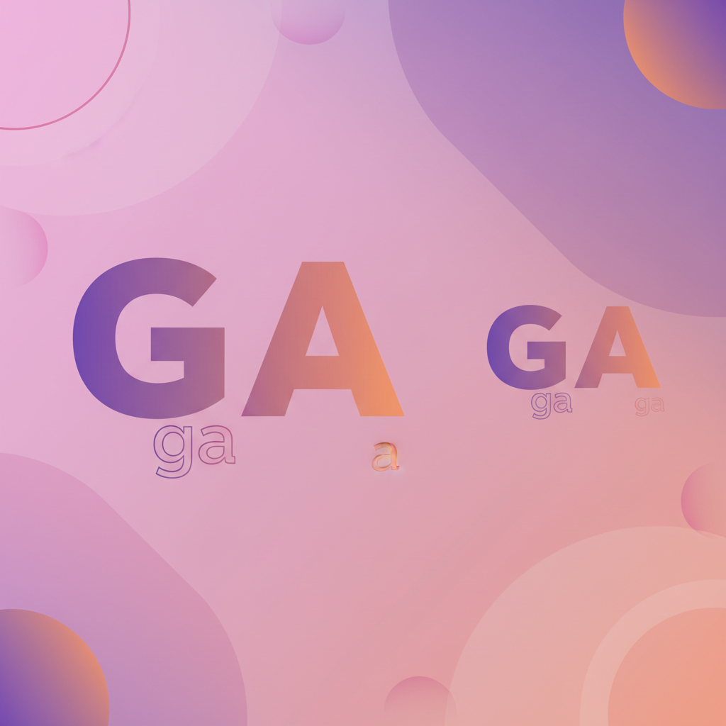
I once made a pin using a beautiful thin script font.
On my laptop it looked genuinely lovely — elegant, expensive, the kind of thing you feel quietly proud of.
In the Pinterest feed on a phone it looked like a smudge.
Nobody could read it, so nobody clicked it, and a perfectly good piece of content died because of a typeface decision made at the wrong zoom level.
That is the entire font problem on Pinterest in one story.
You design at full size and people consume at thumbnail size, and the gap between those two experiences is where most typography goes wrong.
Fonts that look sophisticated large frequently become unreadable small, and unreadable means invisible.
So let me give you what actually works: the font characteristics that survive being shrunk, how to pair two fonts without it looking messy, the styles to avoid, and a simple system so you never have to think about this again.
Bold display
Clean body
Headline + supporting
Heavy sans
Light sans
Same family, two weights
Serif accent
Sans body
Contrast without clutter
What makes a font work at thumbnail size
Forget font names for a moment and think about characteristics, because those are what actually determine legibility.
You want thick strokes, generous letter spacing, clear distinct letterforms, and high contrast against whatever sits behind.
Anything thin, tightly spaced, highly decorative or low-contrast will fail when scaled down.
A useful mental model: your headline font should still be readable if someone glanced at it across a room.
That sounds extreme, but a phone-sized thumbnail in a fast-scrolling feed is genuinely comparable to a quick glance from a distance.
Design for that condition and everything else follows.
The font styles that reliably perform
- Bold geometric sans — clean, modern, extremely legible small. The safest default.
- Heavy grotesque sans — chunky and confident, excellent for short punchy headlines.
- Sturdy slab serif — adds character while keeping thick, readable strokes.
- Simple humanist sans — a versatile, friendly body font for supporting text.
Notice that every one of those is described as bold, heavy, sturdy or simple.
That is not an accident.
On Pinterest the personality comes from your colours, imagery and layout — the font’s job is primarily to be read, and secondarily to have character.
What to avoid
Thin and light weights are the most common mistake, because they look sophisticated in a design tool and vanish at small sizes.
Script and handwriting fonts are the second — they are beautiful and almost never legible as a headline on a phone.
Highly decorative display fonts, condensed fonts with tight spacing, and all-caps in a hard-to-read face round out the list.
None of these are banned outright.
A script font used for one short accent word above a bold headline can look genuinely lovely.
The rule is that your primary message must never depend on a font that struggles at thumbnail size — decorative fonts are seasoning, not the meal.
How to pair two fonts
Two fonts is the right number.
One can feel flat, three or more almost always looks chaotic and amateur.
The pairing principle is contrast with harmony: the two fonts should be clearly different in weight or style, but not fighting each other for attention.
To see a pair on a real pin before you commit, the free font pairing tool draws fifteen Google Font pairs in your own words and says why each one works.
- Pick a bold headline font — this carries your keyword and does the heavy lifting.
- Pick a simple, quiet body font for supporting text, labels and your handle.
- Make the size difference obvious — if they look similar in size, use one font instead.
- Or take the easy route: one font family, two very different weights (Black and Regular).
That last option is genuinely underrated.
Using a single family at Black and Regular weights guarantees harmony, removes the pairing decision entirely, and looks intentional.
If typography is not your thing, start there and you will never make an ugly pin.
Top band
Safest — read first
Centre overlay
Bold, needs a scrim
Bottom third
Good with a gradient
Size, spacing and the details that matter
Font choice is only half of legibility — how you set it matters just as much.
Go bigger than feels necessary; if the headline looks slightly too large on your screen it is probably about right on a phone.
Keep lines short, ideally under about six words, because long lines wrap awkwardly and lose impact.
Add a little extra line spacing so stacked lines do not crowd each other, and avoid setting long phrases in all caps, which slows reading considerably.
Small adjustments here often improve readability more than switching fonts does.
Test at the size people actually see
Before publishing, shrink your pin to roughly thumbnail size and look at it. If the headline is not comfortably readable, the font is too thin, too small, or fighting the background. Design at full size by all means — just always judge at thumbnail size.
Where to find fonts that work
You do not need to buy anything.
Free design tools ship with perfectly good bold sans and slab options, and the standard free font libraries contain several workhorses that are legible, professional and widely used precisely because they hold up at small sizes.
A practical shortcut when browsing: ignore how a font looks in the specimen preview at enormous size, which is designed to flatter it.
Type your actual headline into the preview and shrink it right down.
Most fonts that look intriguing at 96px become unusable at 14px, and that ten-second test filters them out immediately.
One caution worth mentioning if you sell anything: check the licence covers commercial use.
Most free libraries do, but a font grabbed from a random download site may not, and that is an avoidable headache once your pins are earning money.
Fonts and the mistakes they cause
It is worth connecting typography to the wider list of things that make pins fail, because font choice sits behind several of them.
Text too small to read, low contrast, and too many competing styles are all at least partly typographic decisions — and together they account for a large share of underperforming pins.
Text too small to read
No keyword on the image
Low contrast
Wrong aspect ratio
Too many fonts
Which means fixing your fonts is rarely a cosmetic exercise.
Choosing one bold headline face, setting it larger than feels comfortable, and giving it a contrasting backdrop resolves three of the most damaging mistakes at once — full list in pin design mistakes.
Consistency beats variety
Once you find a pairing that works, use it on everything.
Resist the urge to try a new font each time you make a pin; that variety feels creative and reads as inconsistent.
A recognisable typographic style makes your pins identifiable in a crowded feed, which builds familiarity and trust over time.
Lock your chosen fonts into a reusable template so the decision is made once and applied forever — the system behind pin templates that convert.
This also removes a surprising amount of friction: a fresh pin becomes a text swap rather than a series of small creative decisions.
Fonts serve the keyword, not the other way round
One closing reframe worth holding onto.
The purpose of your headline typography is to make a searched keyword instantly readable to a human being.
The font is in service of the phrase; if a beautiful font makes your keyword harder to read, it is actively working against you.
Which means the keyword itself has to be worth featuring in the first place — a perfectly typeset phrase nobody searches for still earns nothing.
Checking real demand before you design is exactly what PinPinterest is for.
Get the phrase right, then set it in a font that makes it impossible to miss.
To see a pairing at full size before you commit to it, the free Pinterest pin maker renders your headline into finished templates in the browser, with no account required.
Make sure the phrase on your pin is one people search
Next: pin colours, text overlay and the complete design guide.
#pinterest fonts#typography#pin design#canva
More in Design10 other guides in this categorySee all Mia Bennett is the pen name the PinPinterest team writes under. Our guides share what we learn building a Pinterest analytics tool — no fluff, just what actually moves traffic.