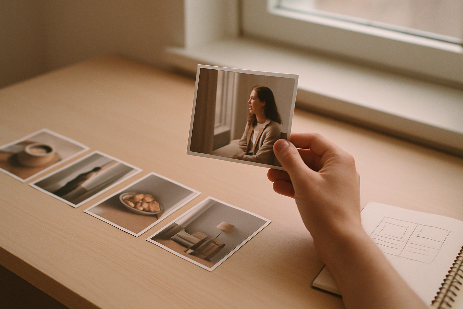
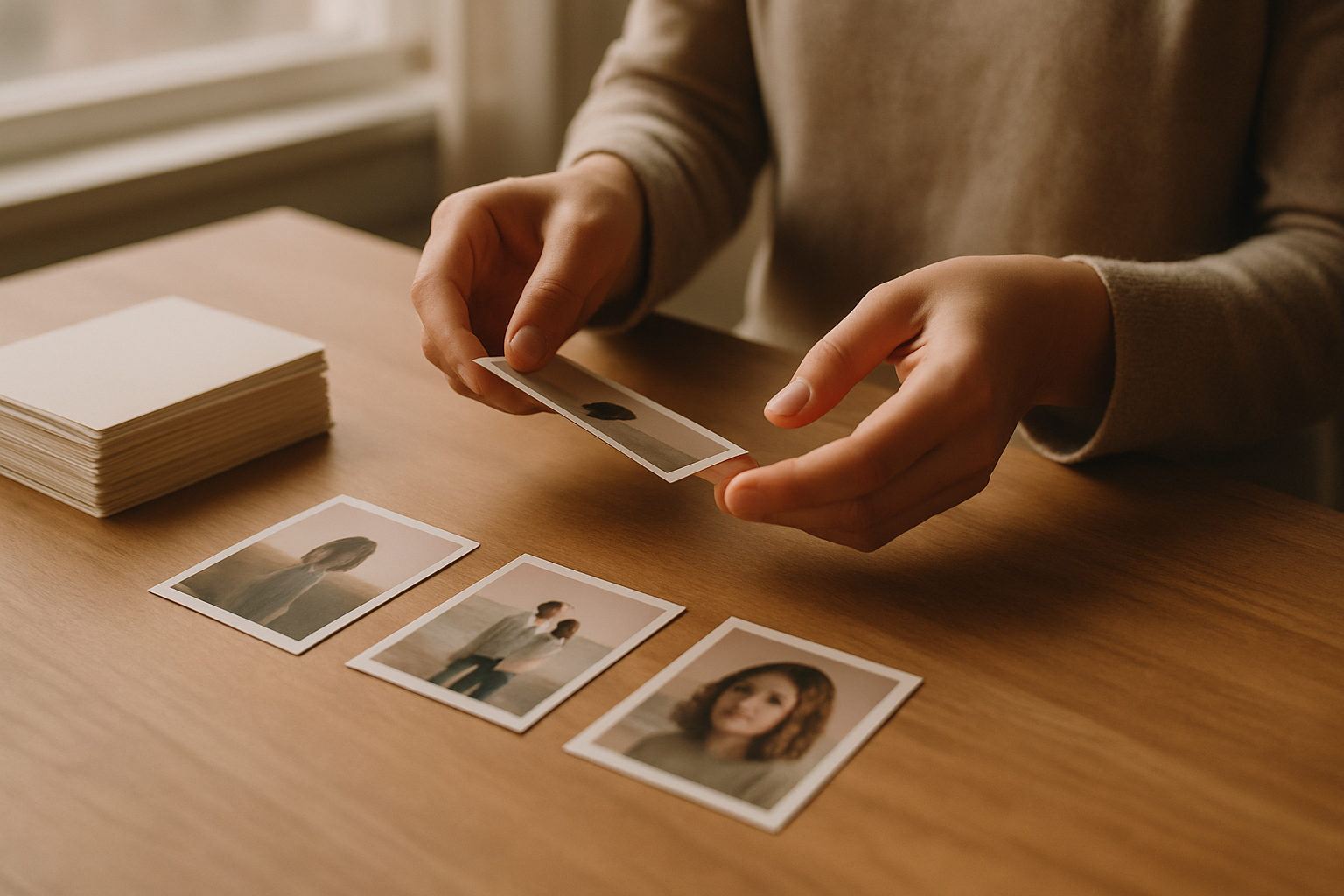
Photos That Work on Pinterest (A Practical Guide)
You don’t need a professional camera — you need the right kind of photo. Here’s what performs on Pinterest, how to shoot it on a phone, and where to find good images.
By Mia Bennett · PinPinterest editorial team

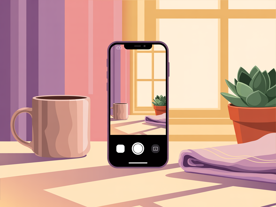
Pinterest is a visual search engine, so the image is not decoration — it is a load-bearing part of whether your pin works.
But there is a persistent myth that this requires professional equipment, and it genuinely does not.
Some of the best-performing pins I have made were shot on a phone next to a window in about four minutes.
What matters is not gear but a handful of characteristics: light, clarity, a single subject, a vertical crop and deliberate space for text.
Get those right and a phone photo outperforms a technically superior image that ignores them.
So let me cover exactly what makes a photo work here, how to shoot better ones without buying anything, where to get images if you do not shoot your own, and the mistakes that make otherwise lovely photos fail on Pinterest.
✓Bright, natural light
✓One clear subject
✕Busy, cluttered frame
✓Vertical crop
✕Dark and murky
✓Space for text
Bright beats moody, almost always
This is the single biggest difference between photos that work on Pinterest and photos that work on, say, a portfolio site.
Bright, clean, well-lit images consistently outperform dark and atmospheric ones in the feed, because they read clearly at thumbnail size and feel inviting rather than heavy.
That does not mean blown-out or clinical.
It means natural light, ideally from a window, with your subject clearly visible and the shadows not swallowing detail.
If your photos consistently look murky, shooting near a window in daylight will fix more than any editing will.
One subject, clearly
A photo with one obvious subject reads instantly; a photo with six competing elements reads as texture.
At the size people actually see your pin, a busy flat-lay with fifteen small objects becomes visual noise, however carefully you arranged it.
So simplify ruthlessly.
One dish, one outfit, one room corner, one product.
Give it space to breathe.
That negative space is not wasted — it is what makes the subject legible, and it doubles as the clean area where your text overlay will sit.
Shoot vertical, and leave room for text
Because pins are 2:3 vertical, a landscape photo has to be cropped hard, which usually means losing either your subject or your composition.
Shooting vertical from the start avoids that entirely and takes no extra effort once you remember to turn the phone.
While you are framing, deliberately leave a clean area — top third or bottom third — for your headline.
Composing with the text in mind is a small habit that prevents the very common problem of a great photo where the words have nowhere readable to go.
The ratio specifics are in pin dimensions.
Practical shooting tips that need no equipment
- Shoot near a window in daylight; avoid overhead artificial light and direct harsh sun.
- Turn the flash off — it flattens everything and creates ugly hotspots.
- Clean, simple backgrounds: a plain wall, a wooden surface, a neutral cloth.
- Take many frames from several angles — top-down, straight-on, three-quarter.
- Tap to focus on your subject and check exposure before shooting.
The multiple-angles point is quietly the most valuable.
One short shoot producing eight usable frames gives you eight distinct fresh pins for the same piece of content, which is exactly the multiplication described in one post into 30 pins.
One more framing habit worth adopting: shoot slightly wider than you think you need.
It is trivial to crop in later and impossible to invent detail you never captured, so a little extra room around the subject gives you options — including the choice to place your headline somewhere that does not cover anything important.
Editing: light touch, big impact
You do not need advanced editing skills.
Raising brightness slightly, adding a little contrast, and correcting white balance so whites look white will improve most phone photos dramatically.
That is genuinely the whole workflow for the majority of pins.
What to avoid is heavy filtering, aggressive saturation and strong vignettes.
Beyond looking dated, they reduce the clarity that makes a pin readable small.
Consistent light editing also makes your pins look like a coherent set, which supports the recognisability discussed in pin colours.
1
Bold keyword headline
The searched phrase — big and readable
2
High-contrast hero image
One clear focal point for the thumb
3
Your logo or handle
Small corner mark that builds trust
4
A clear benefit / promise
Tells a human exactly why to click
Crop and compose for the pin, not the frame
A habit that lifts photo pins immediately: treat cropping as a creative decision rather than an afterthought.
The same photo cropped tight on the subject versus wide with context produces two genuinely different pins, and the tighter crop usually wins at thumbnail size because the subject fills more of the frame.
Get in the habit of producing two or three crops of every good photo — a tight one, a medium one, and one with deliberate empty space for a headline.
That is three distinct fresh pins from one image, each of which can carry a different keyword.
2:3
1000 × 1500 ✓
The sweet spot
1:1
Square — weaker
too tall
Gets cut off
Crucially, do the cropping yourself rather than uploading a landscape image and hoping.
When you leave it to an automatic crop you often lose the subject or your text area entirely, which is an avoidable way to waste a good photograph.
Building a small photo library
The creators who sustain a daily pin cadence are rarely shooting daily — they are drawing from a library.
One focused hour of shooting can produce thirty or forty usable frames across several setups, which is weeks of pins.
So batch your photography the way you batch your design.
Set up once, shoot several subjects from several angles, edit them all in one pass, and file them somewhere you will actually find them.
Then producing a pin becomes “pick a photo, add a headline” rather than a whole production, which is exactly what makes the batch-and-drip rhythm sustainable.
If you do not shoot your own
Plenty of niches do not lend themselves to original photography, and stock imagery is a perfectly legitimate answer.
The risk is looking generic — the same handful of overused stock images circulate endlessly and people subconsciously recognise them, which undercuts trust.
Mitigate that by choosing less obvious images, cropping them distinctively, applying your own colour treatment and always adding your branded text layer.
A well-treated stock photo with your typography reads as yours.
And if your niche allows it, even occasional original photos will noticeably lift how authentic your account feels.
If you want a whole set to share one look, our free film camera filter gives every photo the same film or snapshot treatment and saves each one without its hidden location and camera details.
The image earns the glance; the text earns the click
A beautiful photo with no text gets admired and scrolled past. A clear photo with a specific keyword headline gets clicked. Photography and typography are partners here — neither works properly on its own, and pins that neglect either underperform.
Let the data tell you what to shoot
Once you have published a range of image styles — top-down versus straight-on, bright versus warm, close-up versus wide — look at which consistently earn saves and clicks relative to reach.
Niches differ genuinely here, and your audience will have preferences you would not predict.
That comparison needs performance normalised across pins of different ages, which native analytics does not do — the gap PinPinterest fills.
Shoot with the fundamentals, then let evidence tell you which style your particular audience responds to, and make more of that.
Once you have the shot, the free Pinterest pin maker crops it to 2:3 and lays your headline over it on a readable panel, in the browser and with no account.
See which image styles actually earn saves in your niche
More: text overlay, colours and the complete design guide.
#pinterest photography#pin images#photo tips#pin design
More in Design10 other guides in this categorySee all Mia Bennett is the pen name the PinPinterest team writes under. Our guides share what we learn building a Pinterest analytics tool — no fluff, just what actually moves traffic.