Pinterest Carousel Pins: When They’re Actually Worth It
Carousel pins let you tell a sequence across several cards. Here’s how they work, the content that suits them, and an honest take on whether they’re worth your time.
By Mia Bennett · PinPinterest editorial team

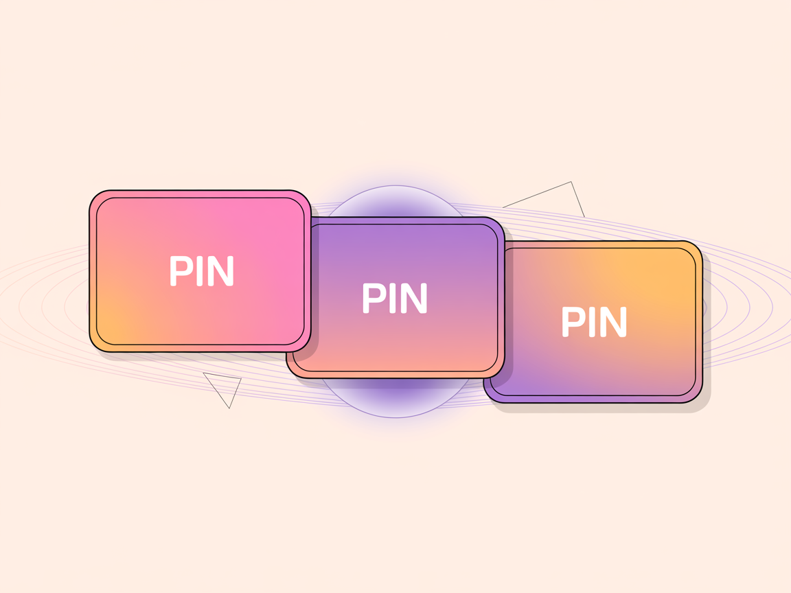
Carousel pins are one of those formats people either ignore completely or assume must be secretly favoured by the algorithm.
Neither is quite right.
A carousel is a pin containing several swipeable cards, and like every format it is excellent at some jobs and a waste of effort at others.
I want to give you an honest assessment rather than a breathless one, because I have made carousels that meaningfully outperformed a static pin and others that were simply three times the work for the same result.
The difference was always whether the content genuinely needed a sequence.
So let me cover how they work, the content that actually suits them, the design rules that make or break one, and a clear answer on whether to bother.
1
→2
→3
Card 1 must earn the swipe
How carousel pins work
A carousel bundles multiple images into a single pin that people swipe through, with each card able to carry its own image and text.
It occupies one slot in the feed like any other pin, and the first card is what everyone sees — the rest only exist for people who choose to engage.
That structural detail drives everything else about the format.
Cards two through five are invisible to the overwhelming majority of people who see your pin.
If your value is buried on card four, most of your audience will never encounter it, which is why weak first cards waste the entire effort.
The content that genuinely suits a carousel
Carousels work when the content is inherently sequential or comparative — where seeing things in order adds real meaning rather than merely splitting one idea across several frames.
- Step-by-step processes where order matters — recipes, tutorials, how-tos.
- Before-and-after reveals, with the transformation across cards. (If you would rather show both at once in a single pin, the free before and after pin maker does exactly that.)
- Multiple angles of one thing — a room, an outfit, a product.
- A short list where each item deserves its own image.
- Comparisons — option A versus option B, laid out card by card.
The common thread is that the sequence carries meaning.
If you could convey the same thing in one well-designed static pin — and frequently you can, especially with an infographic pin — the carousel is adding work without adding value.
Card one is the entire ballgame
Because card one is what appears in the feed, it must work completely as a standalone pin: strong keyword headline, clear image, obvious promise.
Treat it exactly as you would any static pin, applying all the usual design fundamentals.
Then it needs to do one extra job: signal that there is more worth swiping for.
A subtle cue like “swipe for all 5 steps” or a visible card indicator sets the expectation.
Without that, people simply do not know a sequence exists and treat it as an ordinary pin.
Design rules across the cards
Consistency across cards is what makes a carousel feel intentional rather than like a folder of loose images.
Same fonts, same colour treatment, same layout structure, same handle placement.
Each card should be recognisably part of one set.
Keep the count modest — three to five cards is usually right.
Long carousels lose people well before the end, and the effort per card is real.
And every card must be readable on its own, since someone may swipe in and stop after two.
1
Bold keyword headline
The searched phrase — big and readable
2
High-contrast hero image
One clear focal point for the thumb
3
Your logo or handle
Small corner mark that builds trust
4
A clear benefit / promise
Tells a human exactly why to click
The effort maths nobody mentions
Worth being blunt about the economics, because this is what actually decides whether carousels are worth it for you.
A five-card carousel is roughly five times the design work of a static pin, and it occupies exactly one slot in the feed and targets exactly one keyword.
Five separate static pins, by contrast, can target five different long-tail phrases, appear as five separate opportunities in search, and each gets its own chance to be the one that breaks out.
For pure discovery, that is a considerably better use of the same hours.
Save velocity
▲ 214/day
Pin Score
88/100
Rank
#3
Health
Clean
This is why my honest default is static pins for reach and carousels for the specific cases where sequence genuinely adds meaning.
It is not that carousels perform badly; it is that the same effort spread across more keywords usually performs better.
Where carousels genuinely shine
There is one situation where the maths flips decisively: when you already have the images.
If you photographed a recipe step by step, or shot a room from five angles, or have a genuine before-and-after, the marginal cost of assembling a carousel is small because the hard work is done.
In that case a carousel adds depth for very little extra effort and can meaningfully lift engagement, because people who swipe are demonstrating real interest.
So the rule is: do not create content to fill a carousel, but absolutely build one when the content already exists in sequence.
The honest verdict
For most creators most of the time, static pins remain the workhorse and should be the bulk of your output.
Carousels are a supplement worth using when your content is genuinely sequential — and worth skipping when it is not, because the effort multiplies while the reach does not.
This mirrors the honest assessment I gave for video pins: the format is a tool, not a growth hack.
If you are choosing between making one carousel and making three static pins targeting three different keywords, the three static pins will usually serve you better.
Don’t make a carousel to seem sophisticated
Format complexity is not a ranking factor. A simple static pin with a strong keyword and clear design will out-perform an elaborate carousel with a vague first card every single time. Use the sequence when the content needs a sequence — never to look clever.
And do not assume a carousel gets special treatment in distribution.
It competes on the same signals as everything else — relevance, freshness, early engagement — so a carousel with a weak first card is simply a weak pin that happens to have extra cards nobody will ever see.
How to judge whether it worked
Judge a carousel against what a static pin would have done, not against zero.
Compare saves and outbound clicks relative to reach — the engagement rate view — and factor in that a carousel cost you several times the production effort.
If your carousels are not meaningfully outperforming your static pins per unit of effort, that is genuinely useful information: stop making them and reinvest the time into more static pins on more keywords.
Format decisions should be settled by data rather than by what feels modern.
Aim any format at proven demand
Whichever format you choose, the underlying determinant of success is unchanged: is anyone searching for this?
A beautifully sequenced carousel on a topic with no demand behind it earns nothing, while a plain static pin on a well-chosen phrase quietly delivers for months.
So validate the keyword before you commit to the more expensive format — which is exactly what PinPinterest makes fast.
Reserve carousels for topics you have confirmed have real demand and genuinely benefit from a sequence, and they become a sharp tool rather than an expensive habit.
Validate the topic before you build the expensive version
Compare formats: infographic pins, video pins and Idea Pins vs standard pins.
#carousel pins#pinterest formats#pin design#engagement
More in Design10 other guides in this categorySee all Mia Bennett is the pen name the PinPinterest team writes under. Our guides share what we learn building a Pinterest analytics tool — no fluff, just what actually moves traffic.