Pinterest Engagement Rate: How to Calculate It (and What’s Good)
Engagement rate is how you compare pins fairly, regardless of age or reach. Here’s the formula, what a healthy rate looks like, and how to lift yours.
By Mia Bennett · PinPinterest editorial team

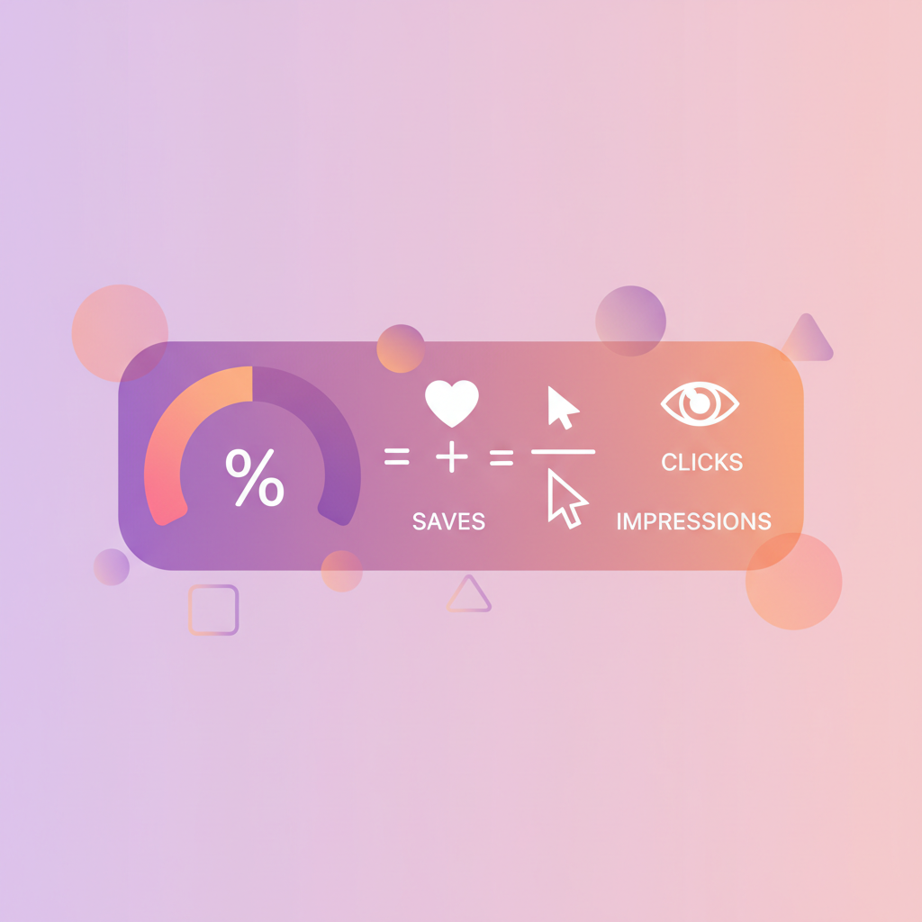
Raw numbers on Pinterest are almost impossible to compare fairly.
One pin has been live for a year, another for a week.
One got shown to fifty thousand people, another to eight hundred.
Comparing their save counts tells you which one is older and luckier, not which one is better.
Engagement rate exists to solve exactly that problem, and it is the metric that finally lets you rank your own work honestly.
I resisted it for a while because it sounded like agency jargon.
It isn’t.
It is simply a ratio that asks: of the people who saw this, how many actually did something?
That question is age-independent, reach-independent, and brutally clarifying.
It is the number that told me my proudest pin was mediocre and my throwaway one was a template worth copying twenty times.
So here is the formula, an honest benchmark, and — more usefully — the specific things that move it.
Saves + Clicks
Impressions
×100 =
4.8%
Anything above ~2% is healthy on Pinterest
The formula (and the variations)
The simplest version is: engagement rate equals total engagements divided by impressions, times one hundred.
On Pinterest, “engagements” usually means saves plus outbound clicks, sometimes with close-ups included.
Pinterest itself reports an engagement figure, but the exact composition can shift, which is one reason I prefer calculating a version I control and applying it consistently.
For the record, Pinterest’s own help page defines it as saves, Pin clicks and outbound clicks divided by impressions, and the free engagement rate calculator works it out that way from the numbers in your analytics.
The consistency matters far more than the precise definition.
Whether you include close-ups or not, apply the same formula to every pin and the comparison stays valid.
What you must not do is compare Pinterest’s reported engagement rate for one pin to a hand-calculated one for another and conclude anything — that is comparing two different measurements and pretending they are the same.
What counts as a good engagement rate
Let me give you a usable rule of thumb while being honest about its limits.
On Pinterest, an engagement rate above roughly two percent is generally healthy, and anything consistently above five percent is genuinely strong.
Below one percent suggests your pins are being shown to people who don’t find them relevant, which is usually a keyword or design problem rather than a quality problem.
But treat those numbers as loose orientation, not gospel.
Rates vary enormously by niche, by pin format, and by whether your keywords attract browsers or doers.
A recipe pin and a B2B service pin live in different universes.
The benchmark that actually matters is your own account over time: is your median engagement rate rising as you learn what works?
That trend is worth more than any industry average you will ever read.
Why it beats every raw number
Engagement rate does something no raw count can: it makes a small pin and a huge pin directly comparable.
A pin with 800 impressions and 60 saves has a 7.5% rate.
A pin with 90,000 impressions and 400 saves has under 0.5%.
On the dashboard the second one looks like the triumph.
In reality the first one is the one to make ten more of — it just hasn’t been given reach yet.
That inversion happens constantly, and it is why people so often scale the wrong thing.
They see a big number, conclude that topic works, and pour effort into replicating something that was actually just widely shown and broadly ignored.
The ratio protects you from that mistake, which over months is worth a great deal of wasted work avoided.
Save velocity
▲ 214/day
Pin Score
88/100
Rank
#3
Health
Clean
How to actually lift your engagement rate
Because it is a ratio, you can improve it from either direction — more engagement, or better-targeted reach.
Both are worth attention, and the second is the one people forget entirely.
- Sharpen relevance: target keywords your content genuinely serves, so the people seeing it actually want it (keyword research).
- Strengthen the promise: a specific, benefit-led headline earns action (pin titles).
- Improve the design: readable text, strong contrast, one focal point (pin design).
- Make it save-worthy: promise something people will want later (saves).
- Fix the destination so clicks stick (outbound clicks).
That second lever — better-targeted reach — deserves emphasis.
Chasing enormous, loosely-related keywords inflates impressions and craters your rate.
Targeting narrower, genuinely matched phrases means fewer impressions but a far higher share of people who actually want what you made, which is both a better rate and a better business.
A lower rate isn’t always worse
If a pin breaks out and reaches a much broader audience, its engagement rate will usually fall — a wider audience is by definition less targeted. That is not a failure. Read rate alongside absolute saves and clicks, not instead of them, or you will end up penalising your most successful pins for being successful.
Use it to build a template, not just a report
The real value of engagement rate is not the number, it is the pattern it reveals.
Sort your pins by rate, look at the top ten, and ask what they share.
Format?
Topic?
Headline structure?
Colour treatment?
Time of year?
Almost always a pattern emerges that you would never have spotted by scrolling your feed.
Then turn that pattern into a repeatable template and run it deliberately — the approach in pin templates that convert.
This is how a metric stops being a report card and becomes a production system: it tells you what to make, and then you make more of it.
The trap of optimising the ratio itself
A word of caution, because ratios invite gaming and gaming ratios is a great way to shrink a business.
You can trivially improve your engagement rate by targeting only tiny, ultra-specific keywords where nearly everyone who sees the pin wants it.
Your percentage will look magnificent and your actual traffic will be small, because you optimised the denominator down rather than the numerator up.
The healthy way to use engagement rate is as a comparison tool between pins at similar reach, and as a trend line for your own median over months — not as a score to maximise at any cost.
What you actually want is rising engagement rate alongside rising absolute saves and clicks.
If the rate climbs while the totals fall, you have made yourself efficient at reaching almost nobody, which is a strange kind of victory nobody wants.
Where the native dashboard falls short
Calculating this by hand across a few hundred pins is exactly the sort of task nobody sustains for more than two weeks.
And even when you do, native analytics still cannot tell you how your rate compares to others in your niche, or which keywords the high-rate pins are actually ranking for — which is the context that makes the number actionable.
That normalised, comparative view is what PinPinterest is built for: momentum and engagement scored consistently across your pins and your niche, with the keyword and rank data behind them.
Engagement rate is the fairest way to judge your own work; the only missing piece is seeing it without a spreadsheet.
Compare every pin fairly — without the spreadsheet
Go deeper on the inputs: impressions, saves, outbound clicks — or back to the analytics guide.
#engagement rate#pinterest analytics#pinterest metrics#benchmarks
More in Analytics10 other guides in this categorySee all Mia Bennett is the pen name the PinPinterest team writes under. Our guides share what we learn building a Pinterest analytics tool — no fluff, just what actually moves traffic.