How to Design Scroll-Stopping Pinterest Pins in Canva (Free)
You don’t need to be a designer to make great pins. Here’s a simple, repeatable Canva system for pins that stop the scroll, rank in search and get clicked.
By Mia Bennett · PinPinterest editorial team

Good news: you do not need to be a designer to make pins that perform.
I make almost all of mine in free Canva in a few minutes each, and they out-click fancier ones all the time.
Because here’s the secret — on Pinterest, clarity beats artistry.
A clear, readable pin with a real keyword will beat a gorgeous, vague one every single time.
Let me hand you my whole Canva system.
Before we open Canva, remember what a pin is for: to win a search and earn a click.
So we’re not making art — we’re making a tiny billboard that says exactly what it offers, fast.
Keep that in mind and design gets a lot simpler.
1
Bold keyword headline
The searched phrase — big and readable
2
High-contrast hero image
One clear focal point for the thumb
3
Your logo or handle
Small corner mark that builds trust
4
A clear benefit / promise
Tells a human exactly why to click
Why clarity beats artistry on Pinterest
Let me repeat the most important design idea, because it saves you from so much wasted fiddling: on Pinterest, clarity beats artistry.
Your pin has roughly half a second to tell a fast-scrolling stranger what it offers.
A stunning, subtle, artistic pin that makes them think has already lost — they’ve scrolled on.
A plain, bold pin that instantly says “Small cozy bedroom ideas for renters” wins, every time.
You’re not entering a design competition; you’re making a tiny, legible billboard.
This is genuinely liberating if you’ve been intimidated by design, because it means you don’t need talent — you need rules.
Big text, strong contrast, one clear focal point, a real keyword.
Follow those and a five-minute Canva pin will out-click a beautiful one a “real designer” agonised over.
I’ve watched it happen more times than I can count.
So drop the pressure to be artistic and pick up the discipline to be clear.
Everything in this guide is really just clarity, broken into steps — the size, the contrast, the keyword on the image.
Get those right and your pins perform, no design degree required.
Start with the right size
This one’s non-negotiable and takes ten seconds: make your canvas a 2:3 ratio — 1000×1500px is the standard.
It fills the feed without getting truncated.
Square pins get less real estate; super-tall pins get cut off and look spammy.
Canva even has a “Pinterest Pin” preset, but double-check it’s 2:3.
The full spec is in pin dimensions & design specs.
2:3
1000 × 1500 ✓
The sweet spot
1:1
Square — weaker
too tall
Gets cut off
Design for the thumb, not the desktop
Most people see your pin small, on a phone, scrolling fast.
So: big legible text, strong contrast, one clear focal point.
If a stranger can’t tell what your pin offers in half a second, they scroll past — and that early scroll-past hurts the engagement signal that sets a pin’s ceiling.
Two or three seconds of clarity is the entire job.
A tiny habit that pays off forever: name your image file for the topic before you upload it.
“small-cozy-bedroom-ideas.png” beats “Untitled-final-FINAL-2.png”, because Pinterest reads that filename as one more clue about what your pin is about.
It takes two seconds in Canva’s download step and quietly reinforces your keyword.
Little signals like this stack up — none of them wins on its own, but together they leave Pinterest in no doubt about what your pin should rank for.
Put the keyword ON the image
This is the step casual designers skip and pros never do.
Pinterest reads the text baked into your image, and humans need it too.
So your headline should be the actual search phrase: “Cozy vibes ✨” is a vibe; “Small cozy bedroom ideas for renters” is a search.
That single change makes your pin eligible for real traffic — it’s Pinterest SEO and a click magnet in one.
Build a template, then remix it forever
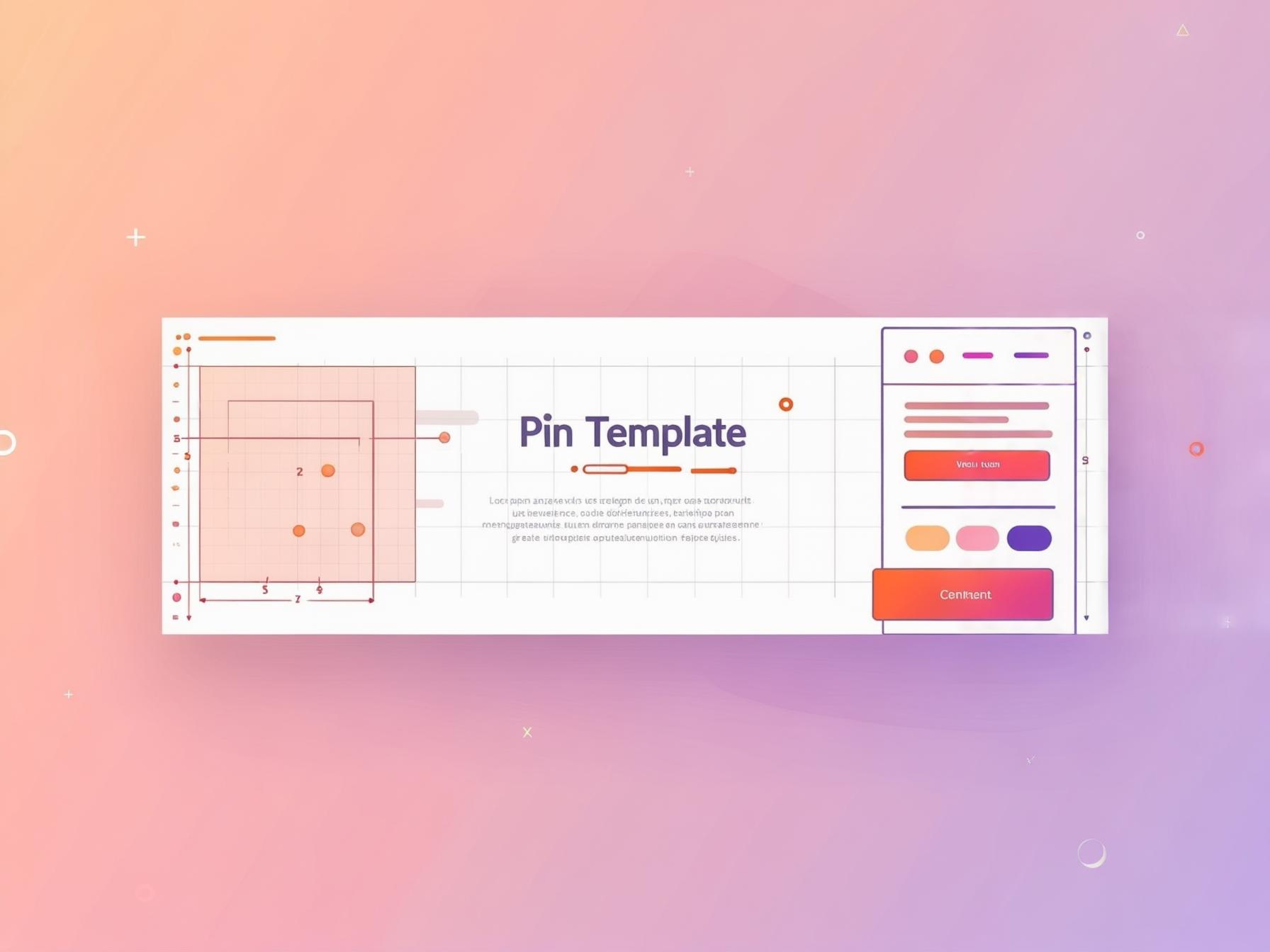
Here’s the time-saver that changes everything: design one clean template — your fonts, colours, layout, logo placement — then duplicate it for every new pin and just swap the text and photo.
It keeps your account visually consistent (which earns followers) and it means a new pin takes two minutes, not twenty.
Consistency plus speed is how you keep the fresh-pin cadence going.
Keep every design fresh
Pinterest favours fresh designs it hasn’t distributed before, so don’t just re-pin one graphic — remix your template into several distinct pins per post.
Different headline, photo, layout and colour treatment, each catching a slightly different scroller.
That’s the engine behind turning one post into 30 pins.
A quick pre-publish checklist
Run every pin past the same short list before you hit publish, so nothing beautiful gets quietly held back by a missing basic.
Pin title
Pin description
Text on image
Image filename
Board title
Destination page
Freshness
Early engagement
Fresh beats perfect
A “good enough” new design you can make in five minutes beats an award-winner you make once a month. Volume of clear, distinct, on-keyword designs is how you find your winners — so lower the bar on polish and raise it on consistency.
Fonts, colours and contrast that actually read
You don’t need design school for this — you need a few rules of thumb that keep your pins readable at thumbnail size.
Pick one or two fonts and stick with them: a bold, chunky font for your headline and a simple clean font for anything smaller.
Skip the thin, curly, decorative fonts — they look pretty on your laptop and turn into mush on a phone.
If a stranger can’t read your headline in half a second, the design failed, no matter how nice it looks.
Contrast is your best friend.
Dark text on a light panel, or light text on a darkened photo, always beats text floating over a busy image.
When your background is a photo, drop a semi-transparent band or overlay behind the words so they pop.
And build a small, consistent colour palette — two or three brand colours you reuse — so every pin looks unmistakably yours.
That recognisability is quietly what turns a saver into a follower.
To keep those colours to hand, the free brand board maker puts them on one page with their codes, and tells you whether light or dark text reads on each.
Common Canva pin mistakes
Most weak pins fail for the same handful of reasons, and every one is a two-minute fix.
Scan your recent pins against this list:
- Text too small or too thin to read on a phone — go bigger and bolder than feels necessary.
- A busy background with no overlay, so the headline disappears into the photo.
- No keyword on the image at all — you’ve made art, not a searchable pin.
- Five fonts and eight colours — cluttered pins get scrolled past; keep it clean.
- Wrong ratio — a square or too-tall canvas instead of clean 2:3.
Fix these and your click-through jumps without any extra talent — you’re just removing the friction between a scroller and your message.
Remember, the whole job of the design is clarity: say what the pin offers, fast, and get out of the way.
To confirm every surface is covered, run each pin past the full SEO checklist.
Templates are a superpower
The single biggest time-saver is a reusable template. Design one clean layout, then duplicate and swap the text and photo for every new pin. Consistency plus speed means a fresh pin takes two minutes — which is how you sustain the daily cadence that Pinterest rewards.
Then let the data pick your style
You don’t have to guess which designs work — Pinterest will tell you, if you’re watching the right numbers.
Make several styles, publish them, and see which earn saves and climb the rankings.
Those are the metrics that matter, and since native analytics hides which designs actually rank, PinPinterest shows you the momentum behind each one so you can make more of what wins.
Then decide format with Idea Pins vs standard pins.
If you want a template without opening a design app at all, the free Pinterest pin maker runs in the browser: upload a photo, pick a layout, download the pin.
See which of your pin designs actually earn saves
#pinterest canva#pin design#canva templates#pinterest design
More in Design10 other guides in this categorySee all Mia Bennett is the pen name the PinPinterest team writes under. Our guides share what we learn building a Pinterest analytics tool — no fluff, just what actually moves traffic.