How to Make Infographic Pins That Get Saved
Infographic-style pins are among the most saved content on Pinterest. Here’s how to structure one, what content suits the format, and how to make them fast.
By Mia Bennett · PinPinterest editorial team

If you want pins that get saved rather than merely seen, infographic-style pins are one of the most reliable formats on the platform.
The reason is simple and slightly obvious once you notice it: a save is someone filing something away for later, and a compact, useful summary is exactly the sort of thing people want to keep.
By “infographic pin” I do not mean an elaborate data visualisation.
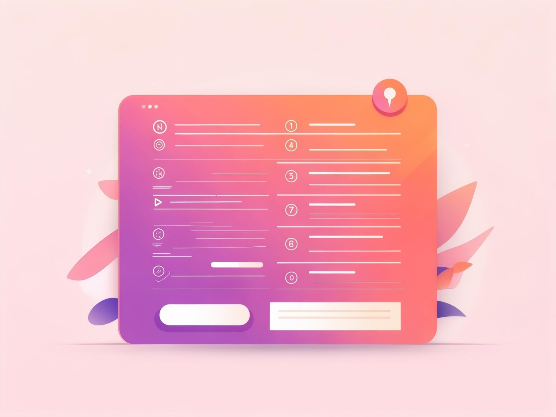
I mean a clear vertical graphic with a headline and a small number of structured points — a checklist, numbered steps, a short list of tips.
Genuinely simple to make, and consistently among the most-saved things I publish.
So let me cover why the format works, how to structure one properly, what content suits it, the trap that kills your click-through, and how to produce them quickly.
1
2
3
4
Headline → numbered steps → your handle
Why the format earns saves
Infographic pins promise portable usefulness.
Someone planning a trip sees “7 things to pack for a long flight”, recognises they will want that later, and saves it.
That decision is much easier than saving a purely aspirational image, because the value is explicit and future-facing.
And because saves are one of the strongest distribution signals Pinterest counts, a format that earns them disproportionately tends to travel further (saves explained).
You are essentially designing for the exact action the algorithm rewards most.
The structure that works
Keep it disciplined — the format fails when it gets crowded.
A strong headline at the top carrying your keyword, three to seven points beneath it, and your handle at the bottom.
That is the whole architecture, and resisting the urge to add more is most of the skill.
- Headline: the search phrase, big and bold, ideally with a number in it.
- Points: 3–7 short items, each a few words — not sentences.
- Visual rhythm: numbers, icons or dividers so the eye can scan it.
- Handle: small, consistent placement so savers remember the source.
- Space: generous margins so it never feels cramped at thumbnail size.
Three to seven is a real constraint, not a soft suggestion.
Beyond seven points the text must shrink to fit, and shrinking text is precisely what makes a pin unreadable in the feed.
If you have twelve tips, that is two pins, not one dense one.
What content suits the format
Anything that is naturally a list, a sequence or a comparison works beautifully.
Checklists, step-by-step processes, do-and-don’t pairs, quick tips, packing or shopping lists, timelines.
Anything where the value is in the structure rather than a single beautiful image.
It works less well for purely inspirational or aesthetic content, where the image itself is the point — an outfit or a room does not benefit from being turned into bullet points.
Match the format to the content rather than forcing everything into it.
The trap: giving away the whole answer
Here is the tension at the heart of this format, and it catches people out constantly.
An infographic pin that fully answers the question earns lots of saves and almost no clicks, because there is no reason left to visit your site.
You have satisfied the curiosity entirely on Pinterest.
The fix is not to be coy or misleading, which backfires badly.
It is to make the pin a genuinely useful summary while the destination offers the substance — the how, the detail, the printable, the full instructions.
List the seven things; explain how to actually do them on your page.
That balance is the same one covered in outbound clicks.
Summary on the pin, substance on the page
Your infographic pin should be complete enough to be worth saving and incomplete enough to be worth clicking. If someone can act fully on the pin alone, you have built a lovely piece of free content for Pinterest rather than a traffic driver for yourself.
Design details that keep it readable
The usual legibility rules apply and matter even more here, because you are fitting more elements into the same space.
Bold headline font, plain body font, strong contrast, one or two colours plus a neutral.
Use numbers or simple icons to create scanning rhythm rather than relying on dense text blocks.
And test at thumbnail size relentlessly — an infographic pin that looks tidy at full size can become an unreadable grey texture when shrunk.
If the individual points are not readable small, cut points until they are (fonts and colours both apply directly).
Text too small to read
No keyword on the image
Low contrast
Wrong aspect ratio
Too many fonts
Numbers in the headline do real work
One small detail that consistently lifts this format: put a number in the headline.
“7 small bedroom storage ideas” outperforms “small bedroom storage ideas” with remarkable reliability, and the reason is psychological rather than algorithmic — a number sets a clear expectation of scope.
People know exactly what they are getting and roughly how long it will take to absorb, which lowers the barrier to both saving and clicking.
It also gives your pin a natural structure to design around, since the number tells you how many rows your layout needs.
Keep the number honest and modest.
Seven genuinely useful points beats “27 ideas” where twenty of them are filler, and an inflated count that the destination does not deliver is the fastest way to lose the trust you just earned.
It still has to work as a pin
It is easy to get absorbed in the list content and forget that an infographic pin is still competing in the same feed as everything else.
The headline still needs to be the biggest thing on it, the contrast still needs to hold up small, and your handle still needs to be there so savers remember the source.
1
Bold keyword headline
The searched phrase — big and readable
2
High-contrast hero image
One clear focal point for the thumb
3
Your logo or handle
Small corner mark that builds trust
4
A clear benefit / promise
Tells a human exactly why to click
A useful check: cover the list portion and ask whether what remains would function as a decent pin on its own.
If the headline alone does not communicate the promise clearly, the list underneath will not rescue it — because in the feed the headline is most of what people register.
Making them fast
These sound labour-intensive and are not, provided you template them.
Build one layout with a headline slot and, say, five numbered rows, then produce every future infographic pin by swapping text.
Ten minutes for the first one, two minutes for every one after.
That speed is what makes the format practical at the cadence Pinterest rewards.
Combined with the template discipline from pin templates that convert, you can turn a single blog post into several distinct infographic pins each targeting a different long-tail phrase.
Pick list topics people actually search
The format only pays off when the list is one people want.
“7 small bedroom storage ideas” works because there is real demand behind the phrase; a beautifully designed list nobody is searching for earns nothing regardless of how tidy it looks.
So start from a verified keyword and build the list to serve it, rather than making a list and hoping.
Checking that demand before you design is exactly what PinPinterest is for — real demand data and competition, so the infographic pins you spend time on are aimed at phrases that can actually deliver saves and traffic.
For the layout itself, the free Pinterest pin maker has panel templates with a fixed headline slot, so numbered lines stay legible at feed size.
Check demand before you design your next list pin
Related: carousel pins, text overlay and the complete design guide.
#infographic pins#pin design#saves#visual content
More in Design10 other guides in this categorySee all Mia Bennett is the pen name the PinPinterest team writes under. Our guides share what we learn building a Pinterest analytics tool — no fluff, just what actually moves traffic.