Blog Images That Double as Pins (One Shoot, Two Jobs)
Stop making images twice. Here’s how to shoot and crop so the same work serves your post and Pinterest — plus where the pinnable image belongs inside an article.
Most bloggers do this work twice.
They shoot and edit images for the post, publish it, and then later sit down to make “Pinterest images” as a separate chore — usually weeks later, usually reluctantly, often never.
It’s a huge amount of duplicated effort caused entirely by treating the two jobs as unrelated.
They’re not unrelated.
With about ten minutes of forethought at the shooting stage, the same session produces both, and the Pinterest version stops being a task you dread and becomes a by-product of work you were doing anyway.
That’s the whole idea here.
The catch is that posts and pins want genuinely different shapes, and you can’t crop your way out of a photo that wasn’t framed for both.
So the planning happens before you press the shutter.
In the post
16:9 · wide
On Pinterest
2:3 · tall
Shoot loose, crop twice
Your post wants something wide — 16:9 or thereabouts, sitting comfortably in a column of text.
Pinterest wants tall: 2:3, typically 1000×1500.
Those are close to opposite, which is why a photo composed tightly for one is usually unusable for the other.
When you come to cut the pin, the free image size checker crops the tall version to 1000×1500 without the photo ever leaving your browser.
The fix is to frame with headroom.
Leave generous space above and below your subject so there’s room for a vertical crop, and keep the subject slightly off-centre so neither crop looks awkward.
Shoot vertically where you can — you can always crop a tall photo to wide, but you can never invent the top of a frame that isn’t there.
Leave room for the headline
Pins nearly always need text on them, and text needs somewhere to live that isn’t on top of the thing you’re trying to show.
So when you’re composing, deliberately leave a calm area — a stretch of wall, worktop, sky, tablecloth — in the top or bottom third.
That empty space is not wasted; it’s where your headline goes.
This one habit makes pin design about three times faster, because you’re no longer fighting a busy image with drop shadows and scrims to make words legible.
The design side is covered in text overlay on pins and pin design.
✓Bright, natural light
✓One clear subject
✕Busy, cluttered frame
✓Vertical crop
✕Dark and murky
✓Space for text
Where the pinnable image goes in the post
Put at least one tall, fully-designed pin image inside the body of the post — not just in the sidebar, not just as the featured image.
When a reader hits the save button in your share bar, or uses the browser extension, the images in the post are what they can choose from.
If there’s no pinnable image there, they’ll pin your wide featured image, which looks terrible on Pinterest and performs accordingly.
Headline
Intro paragraph
Tall pin image
Section one
Section two
Tall pin image
Conclusion
Two is the number I’d aim for: one after the introduction, once the reader knows the post is what they wanted, and one near the conclusion when they’ve got value and are most likely to save it.
More than that starts to interrupt the reading experience for people who came from Google and don’t care about Pinterest at all.
The practical checklist
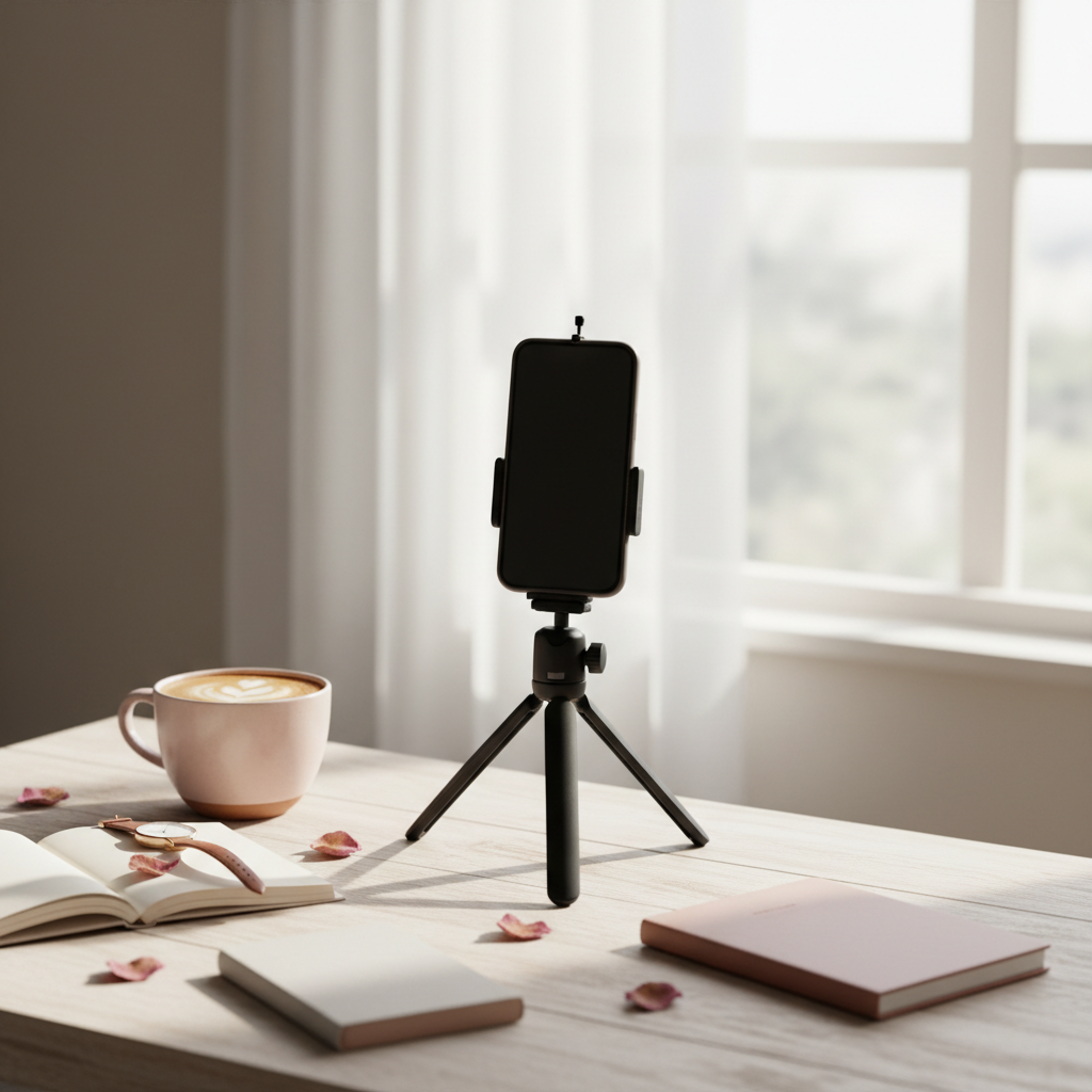
None of this needs a proper camera or a studio.
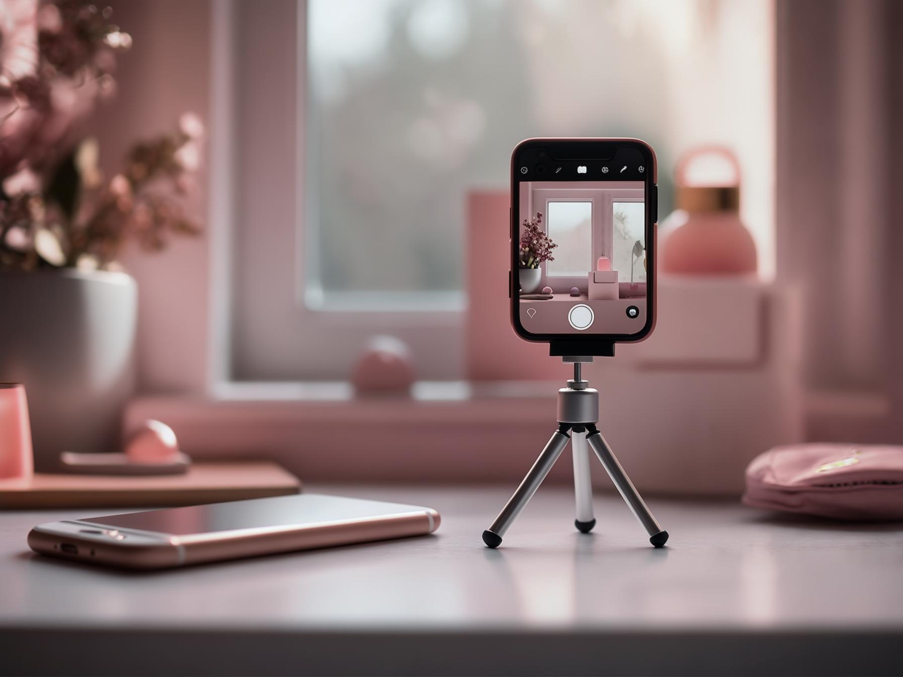
A phone by a window, a tidy background and a bit of intention beats expensive gear used carelessly, and always has.
What matters is consistency and legibility, not production value.
- Shoot vertical, or wide enough to crop vertical. Never tight-crop in camera.
- Natural light from the side, never the flash, never overhead spotlights.
- Leave a calm third for the headline — plain wall, worktop, sky.
- Export the pin at 1000×1500. Anything wider gets cropped in feed.
- Compress before uploading to your blog. Big files slow your post, which hurts everything.
- Give every image a descriptive alt text — it helps accessibility, search and the pin description.
That alt-text point is worth a moment.
When someone pins directly from your site, some of your on-page context travels with it, so a lazy “IMG_4471” is a wasted signal.
Describe the image the way you’d describe it to someone on the phone, naturally including the phrase the post targets.
It’s also worth keeping the originals.
Shoot more frames than you need, keep the full-resolution files somewhere sensible, and name the folder after the post.
Six months later when you want three more pins for that article, having the raw shots means twenty minutes of cropping rather than restaging the whole thing — and restaging is exactly the friction that stops people making more pins for posts that deserve them.
Build one template and stop redesigning
Make a single pin template with a headline zone, an image zone and your site name, then reuse it forever.
Swap the photo and the headline; leave the structure alone.
Your pins become recognisable, which genuinely helps in a crowded feed, and a batch of six becomes a twenty-minute job.
Redesigning from scratch each time is the single biggest reason bloggers fall behind on pinning.
It feels productive and it’s mostly just decision-making.
Templates that convert and Canva pin design cover how to build one properly.
Don’t let the images slow your post down
There’s a tension here worth naming: Pinterest wants large, crisp images, and your page speed wants small files.
Get this wrong and you’ve traded search rankings and reader patience for prettier pins, which is a bad deal in both directions.
The resolution is boring and effective — export at the size you actually display, compress properly before uploading, and let lazy loading handle images further down the page.
A 1000×1500 pin image should land somewhere around 150–250KB, not two megabytes.
If your post takes six seconds to load on a phone, the Pinterest visitor who clicked through is gone before they see any of it, and every pin pointing at that post is quietly wasted.
Different photos beat different filters
When you make several pins for one post, change the photo, not the colour grade. Pinterest treats near-identical images as duplicates and near-identical images bore humans too. Three distinct shots from the same shoot is the cheapest way to get three genuinely different pins — which is exactly why you take more frames than you need.
One template does not mean one look forever, either.
Rebuild it once a year if you want, or keep two variants for different content types — a recipe layout and a list layout, say.
What you’re avoiding is redesigning per pin, not evolving your style over time.
Those are very different things, and conflating them is how people justify spending an hour on a single pin.
Does any of it actually help ranking?
Indirectly, and strongly.
Image quality doesn’t rank you by itself, but it drives saves and clicks, and those absolutely do feed distribution.
A well-lit, well-cropped, legible pin gets engaged with; a dark, cramped, tiny-text pin doesn’t.
That gap compounds across hundreds of pins.
Which of your images are actually earning that engagement is worth measuring rather than guessing — PinPinterest shows you which pins rank and hold their position, so you can see whether a design change moved anything.
Related reading: pin photography and pin design mistakes.
See which of your pin designs actually rank
Next: how many pins per post, a weekly workflow and Pinterest for bloggers.
#blog images#pin design#blog photography#blogging
More in Blogging7 other guides in this categorySee all