Pinterest Board Covers: Make Your Profile Look Professional
Board covers are the first impression your profile makes. Here’s how to choose or design them, the right dimensions, and how much they actually matter.
By Mia Bennett · PinPinterest editorial team

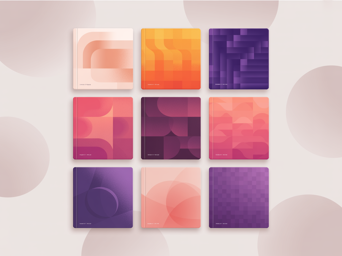
Your profile page is a grid of board covers, and that grid is the first impression almost every visitor forms of you.
Before they read a single board name properly, before they open anything, they get an instant gut reaction from those thumbnails: this looks considered, or this looks like a junk drawer.
That reaction happens in well under a second.
Board covers are how you control that.
A cover is simply the image shown for a board on your profile — either one of the pins inside it or a custom graphic you have made.
Cohesive covers make an account look intentional and trustworthy; random ones make even good content look accidental.
Let me be upfront about how much this matters, though, because I do not want you spending a weekend on covers instead of pins: this is polish, not distribution.
It will not change how you rank.
It does affect whether a visitor who has already found you decides you are worth following — which is a real but secondary job.
1
Keyword-rich name
“Easy Weeknight Dinners”, not “Yum!”
2
Keyword description
2–3 natural sentences with the topic
3
Tight, on-topic pins
Every pin matches the board theme
4
Strong cover + order
Best boards and pins up top
Your two options
The simplest approach is to choose an existing pin from inside the board as its cover.
Pick the strongest, clearest, most representative image you have.
This costs nothing, takes seconds, and honestly gets you eighty percent of the benefit — a profile of strong, well-chosen photos already looks good.
The more polished approach is custom cover graphics: simple branded images, usually with the board name in your brand fonts and colours.
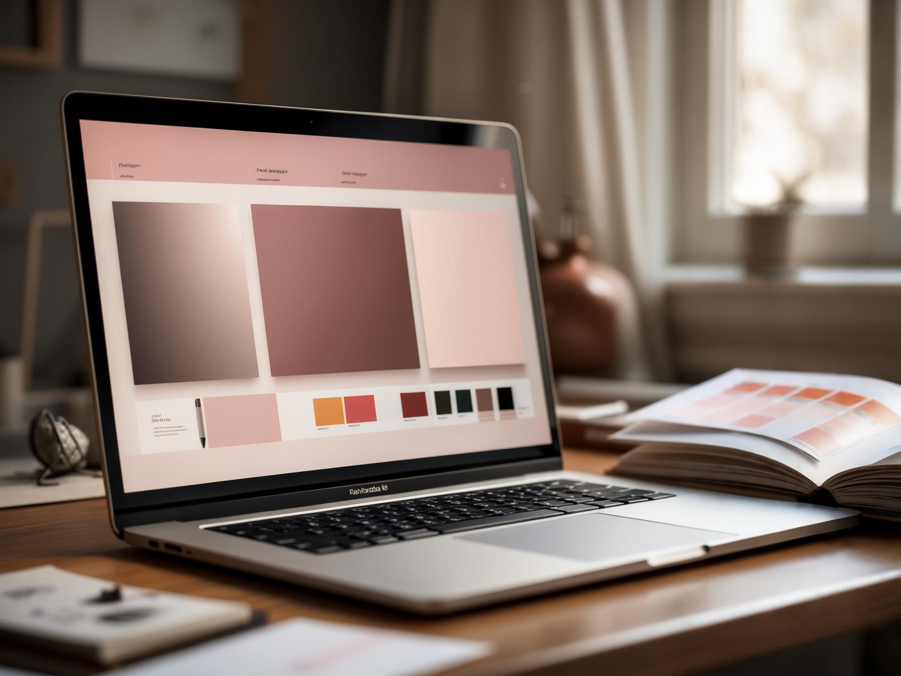
If you have not pinned down those fonts and colours yet, the free brand board maker puts them on one page, with the codes and which text reads on each colour.
This gives a strikingly cohesive profile that reads as a professional resource, at the cost of some design time upfront and a little maintenance when you add boards.
Getting the dimensions right
Covers are displayed as a square-ish crop on the profile grid, so the practical rule is: keep anything important in the centre.
If you design custom covers, work square and centre your text and focal point so nothing critical gets clipped at different screen sizes.
A common mistake is designing covers at standard tall pin dimensions and then wondering why the text is cut off — a tall 2:3 graphic gets cropped hard into a square slot.
If you want to reuse the general design language of your pins, rebuild it square rather than reusing the pin itself.
The ratio principles in pin dimensions apply, just to a different shape.
2:3
1000 × 1500 ✓
The sweet spot
1:1
Square — weaker
too tall
Gets cut off
What makes a cover work
The same clarity rules that govern pin design govern covers, just at a smaller size where they matter more.
Covers are displayed small, so fine detail and small text disappear entirely.
Strong contrast, one clear focal point, and text large enough to read at thumbnail scale are the whole game.
- One consistent style across every cover — same fonts, same palette, same treatment.
- Text big enough to read as a thumbnail (much bigger than feels necessary).
- High contrast so it stays legible on light and dark screens.
- Keep the focal point centred so nothing important gets cropped.
- Make sure the cover actually represents what is inside the board.
That consistency point is doing most of the work.
A profile where all covers share a palette and typographic style looks professionally curated even if each individual cover is very simple.
Cohesion beats individual polish here, which is good news because cohesion is easier.
Build them from one template
The practical way to do custom covers without losing a weekend is a single reusable template.
Build one square design in free Canva with your fonts, colours and a text slot, then duplicate it for each board and swap the words.
Twenty covers becomes a twenty-minute job instead of a project.
This is the same efficiency principle behind pin templates that convert — build once, remix forever.
And crucially, it makes maintenance trivial: adding a new board later is a two-minute duplicate rather than an attempt to remember what you did months ago.
Don’t let covers become procrastination
Board covers are genuinely the most fun and least important task on this list. They will not get you found. If you have a choice between designing beautiful covers and publishing five fresh, keyword-optimised pins this week, publish the pins. Do covers when the pipeline is already running.
Should you use custom covers at all?
Honest answer: it depends entirely on what kind of account you are running.
If you are a business, a service provider or anyone selling something, custom covers are worth the afternoon — a cohesive profile grid genuinely signals professionalism to someone deciding whether to trust you with money.
If you are a blogger or creator whose pins are already strong, striking photographs, using your best pins as covers often looks better than custom graphics.
A grid of beautiful food photography is more appealing than a grid of text tiles, and it costs you nothing.
Food, fashion, travel and photography accounts frequently look worse with custom covers, not better.
So the deciding question is: are my existing pins visually strong enough to carry the grid on their own?
If yes, curate rather than design.
If your pins are mostly text-led graphics or the grid looks chaotic, custom covers will bring welcome order.
1
Bold keyword headline
The searched phrase — big and readable
2
High-contrast hero image
One clear focal point for the thumb
3
Your logo or handle
Small corner mark that builds trust
4
A clear benefit / promise
Tells a human exactly why to click
Keeping covers maintainable
The hidden cost of custom covers is maintenance.
Every new board needs one, and if you rebrand you need to redo the whole set.
Plenty of accounts have a beautiful cohesive grid for the first twelve boards and then a visible drift where later boards use random pins because the template got lost.
Two habits prevent that.
Keep the template file somewhere obvious and permanent rather than buried in a downloads folder, and make a new cover as part of your board-creation routine rather than as a separate task for later.
Later, reliably, never comes — the same reason the batching habits in pin templates work so well.
Order your boards while you are in there
Since you are already curating the profile grid, take two minutes to reorder your boards so your strongest and most relevant ones sit at the top.
That ordering shapes first impressions far more than the individual cover images do, and it costs nothing.
Rotate seasonal boards up as their moment approaches and back down afterwards.
A profile that visibly reflects what is currently relevant reads as active and cared-for, which is exactly the impression that converts a visitor into a follower.
Polish supports substance
Covers, ordering and consistency all help someone who has already found you decide you are worth following.
But none of them help anyone find you in the first place — that job belongs entirely to your keywords, board names, descriptions and fresh pins.
So get the substance right first: boards named after phrases with verified demand, descriptions that reinforce them, and a steady stream of optimised pins.
Checking that demand is exactly what PinPinterest is for.
Then make it all look good — polish on top of substance compounds, while polish on top of nothing is just a nicely presented empty shop.
Get the substance right — real keywords behind every board
More: board names, pin design in Canva and the complete boards guide.
#board covers#pinterest design#profile#branding
More in Boards15 other guides in this categorySee all Mia Bennett is the pen name the PinPinterest team writes under. Our guides share what we learn building a Pinterest analytics tool — no fluff, just what actually moves traffic.